
Title
Amorphous
Amorphous
Category
Augmented Reality,
Wayfinding
Augmented Reality,
Wayfinding
Year
2023
2023
Augmented Reality Wayfinding And Identity System For Queer Art
Principle Investigator: Linh Dao
Designer & Researcher: Elise Coatney
Developer & Researcher: Chenin Rowe
Timeline: 3 Months
Abstract
A guerilla queer art augmented reality learning experience, consisting of an identity and wayfinding system as well as an original digital archive. Our design team used a user-centered design framework to combine two- and three-dimensional typography with original symbols, to make living signage that transforms and blurs the barriers between physical and digital space.
Introduction
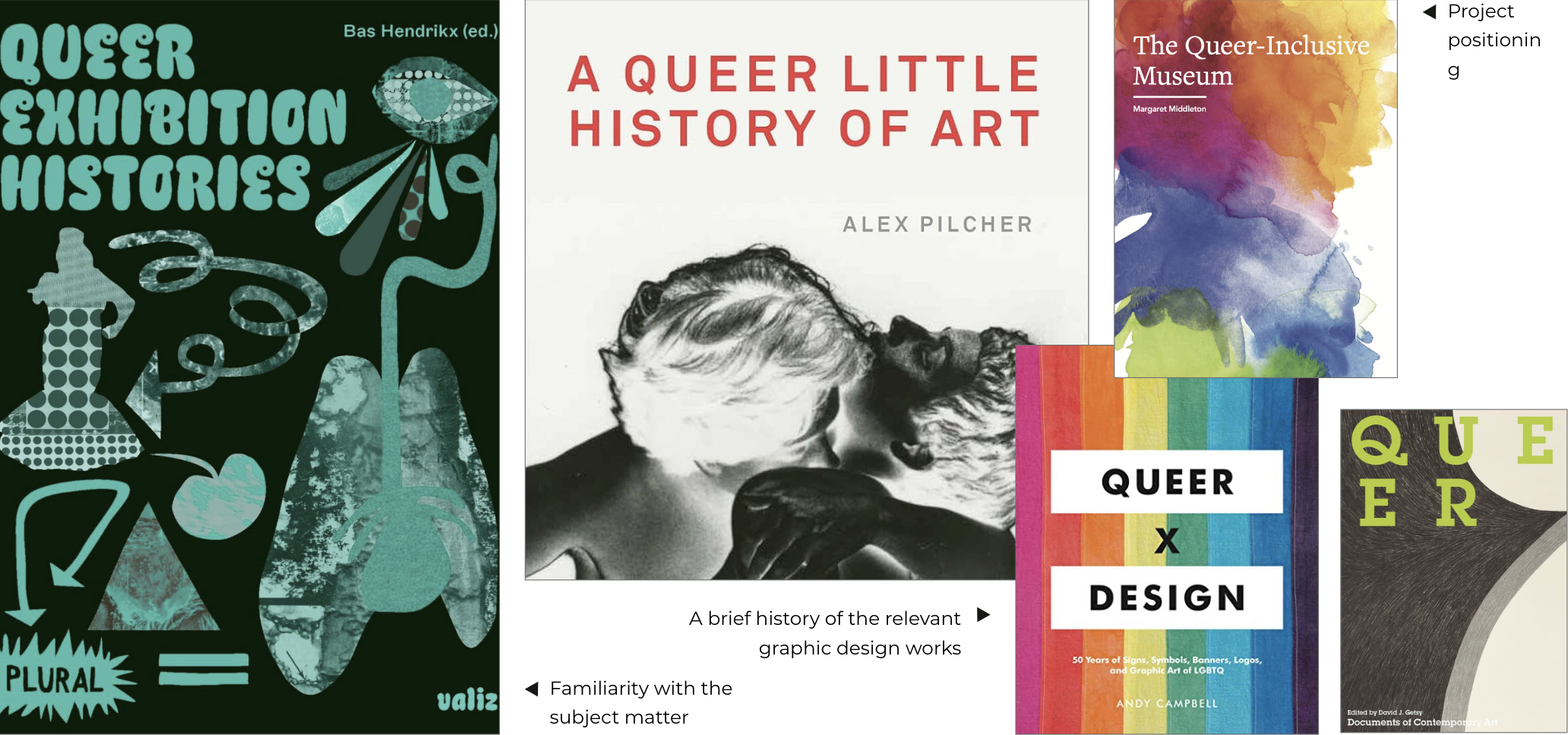
San Francisco's GLBT Historical Society Museum is the first stand-alone museum dedicated to gay, lesbian, bisexual, and transgender history. Before this museum opened, queer people and people interested in queer art had trouble finding accessible galleries. Many barriers prevented them from participating - lack of interest, money, transportation, and specifically curated content. We asked whether new tech could help institutions bridge that gap. Our answer: Amorphous, a wayfinding project that doubles as an external queer-art archive via printed and augmented-reality signage. Backed by an eight-week grant, we mentored undergraduates to build the prototype, which they showcased to Cal Poly’s the Dean, Associate Deans, faculty, student researchers, and the public during Research Week 2023.
Social, Theoretical, and Philosophical Context
On one hand, we look to institutions to provide visitors with adequate information to appreciate the artwork, anticipate their curiosity, and acceptance of queerness (Thaddeus-Johns). On the other hand, we are skeptical of the institutional model (Loiseau 2022), and are interested in alternative methods of display and exhibition. Our project was first conceived for a conventional museum setting adjacent to the permanent collection, to fill in the gaps where one-off Pride-month shows or niche queer galleries rarely convey the work’s full significance and require heavy curatorial buy-in (Middleton 2017). After consulting museum professionals, we pivoted to a guerrilla installation strategy: occupying spaces outside the institution while still extending existing collections and developing queer-themed programs. Through deliberate placement and interpretation, the exhibition now threads a coherent queer narrative that fills in the gaps in queer art knowledge outside of institutions as well, a much vaster space.
Method
Art gallery and museum professionals, as well as historians were involved early and throughout the conceptual inquiry, user study, design production, and evaluation phases.
Our preparations included planning, organizing materials and schedules, and identifying potential obstacles. A literature review collected by the principal investigator was distributed. Expertise outside of our own was sought for the project.
Research and interpretation
In the first and second weeks of the research and design process, we focused on the development of the artist collection and categories. Our collection of queer abstract art was difficult to categorize for a variety of reasons, one of which is the fact that being overtly sexual in the artwork would have exposed them to harassment, discrimination, and death (Moffitt).

During weeks three and four, we focused on design research and conception. Design research techniques were used to survey contemporary design identity and branding examples. We also examined the project's conceptual background. A typographic study was conducted at this stage, along with early sketches of the visual identity and interactive components.
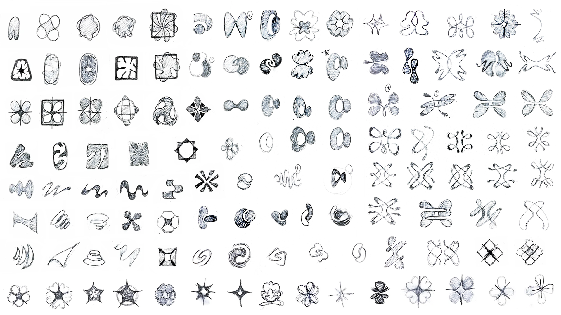
The use of abstraction instead of figurative representation was intended to avoid the troubling trend of superficial depictions of queerness (Moffitt) was decided at this stage. We made this choice to focus on the complex queer experience and expressions, of which sexuality and desire are only a part, in an innovative and oblique way. Our visual approach involves manipulating spatial dynamics, which we discovered to be tremendously helpful in achieving our intended outcome, which is both two- and three-dimensional. The other approach that we used was to reject sensual forms, prioritizing minimalism and control, with decisive shapes and forms (Moffitt). We moved back and forth between these two polarizing approaches while including some forms that referenced queer motifs, such as flag shapes, which communicate clearly.

Weeks five and six were spent developing the visual identity and interactive elements. We conducted and interpreted preliminary tests with targeted audiences to survey the visual appeal, communication clarity, and effectiveness of initial design solutions.

The production and iteration of two- and three-dimensional assets took place during this time, bringing many hand-sketches to life. In some ways the design for this experience is very much following the tradition of sculpture, and allow the space itself to reveal, but it is unique in the way it cannot be seen from all around, but only slight on the sides, and in the front, yet occupying the physical space as seen on a mobile device. The world inside of the the device, is altered, and unique in a few ways. In some ways the design for this experience is very much following the tradition of sculpture, and allow the space itself to reveal, but it is unique in the way it cannot be seen from all around, but only slight on the sides, and in the front, yet occupying the physical space as seen on a mobile device. The world inside of the the device, is altered, and unique in a few ways.

In weeks seven and eight, the remaining digital elements were built and augmented reality experiences were implemented. The digital archive was prototyped and expanded with individual pages for each artist. At this point, some visual assets like meshes and textures were redesigned and optimized, along with the interactive component. In addition, we have gathered and organized research and design documents.
![]()
Results
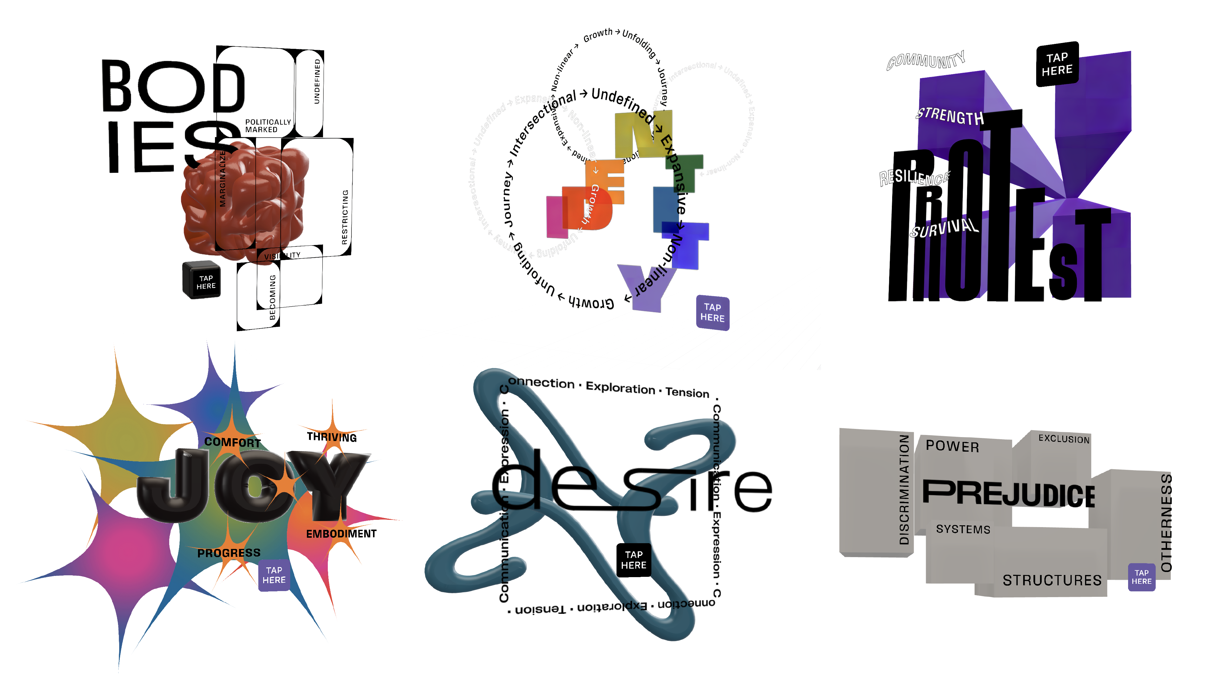
We designed an interactive wayfinding system that incorporates augmented reality. We also developed a responsive website for a collection of 100 queer artists. Young queer survey participants responded mostly positively to our initial internet survey. Testing heuristics showed that maintaining augmented reality displays depends on the device's proximity to physical signage. Our testing led to findings that were not available anywhere else regarding blurring the line between the digital and real worlds using the latest technology.

Discussion
The addition of another artwork category is essential as we recognize how our categorization system can easily be mistaken for pigeonholing artwork. A more comprehensive guidelines for submission will also be developed, similar to how the People of Graphic Design Archive limits its archive to ten years and older to allow users to reflect on why their uploads are worthwhile. We imagine that there could be a collection inside of this collection, in which curators and participants can vote to highlight the most relevant works.
The response of art galleries and museums was a major concern during the ideation and conception of the project. Though they are interested in new technology integration, there were concerns about othering existing artworks. Others were concerned with the practicality and usability of the QR code implementation resulting in a low-response rate. Since our system also includes other visual expressions like icons that are simpler to understand, we worked on the specific and installation layout and locations to approach that issue.
There are many technologies currently able to deliver this experience. With the software available to us, we found some unique features. We found that our initial plans for installation and labeling, which is a major part of our wayfinding system, required additional time to develop. They were extensively tested to meet our users' needs.

Limitation
The project has two major limitations that we perceive to be critical: Firstly, due to the limited budget and time, the project has not yet undergone extensive user testing. Secondly, the project requires the recommendation of an art gallery or museum professional in order to further develop an artist collection. The existing artist collection is a starter archive, selected from the literature we have access to, which requires professional assistance to grow into a one-of-a-kind democratic and centralized hub. Third, getting materials on the design or development of wayfinding AR solutions is difficult, with little interest in wayfinding at museums or galleries. There has been similar use of technology, but little knowledge of how to specifically design signage.
Conclusion(s)
We produced a highly competent, practical, and extensive creative and scholarly project centered on serving people of color, with disabilities, belongs to LGBTQ+ community, or any otherness. The opportunity helped participating students connect to their community of choice, solve a real-world problem, and develop resilience, and empathy, which are highly sought after soft skills in the workplace.
We plan to continue working on the project to test, iterate, and refine the visual outcomes to produce a research paper. The paper will be written with our student researchers, highlighting their contribution and roles in the design and development, methodological support, and data analysis and interpretation of the project.
References
Campbell, A. (2019). Queer X Design: 50 years of signs, symbols, banners, logos, and graphic art of LGBTQ. Black Dog & Leventhal Publishers.
Collection. Whitney Museum of American Art. (n.d.). https://whitney.org/collection
The collection: Moma. The Museum of Modern Art. (n.d.). https://www.moma.org/collection/works
Getsy, D. J. (2016). Queer. Whitechapel Gallery.
Pilcher, A. (2018). A queer little history of art. Tate.
Reviews. Artforum. (n.d.). https://www.artforum.com/print/reviews
Summers, C. J. (2004). The Queer Encyclopedia of the visual arts. Cleis.
︎ Back to top
Previous Project
Next Project