Artist Statment
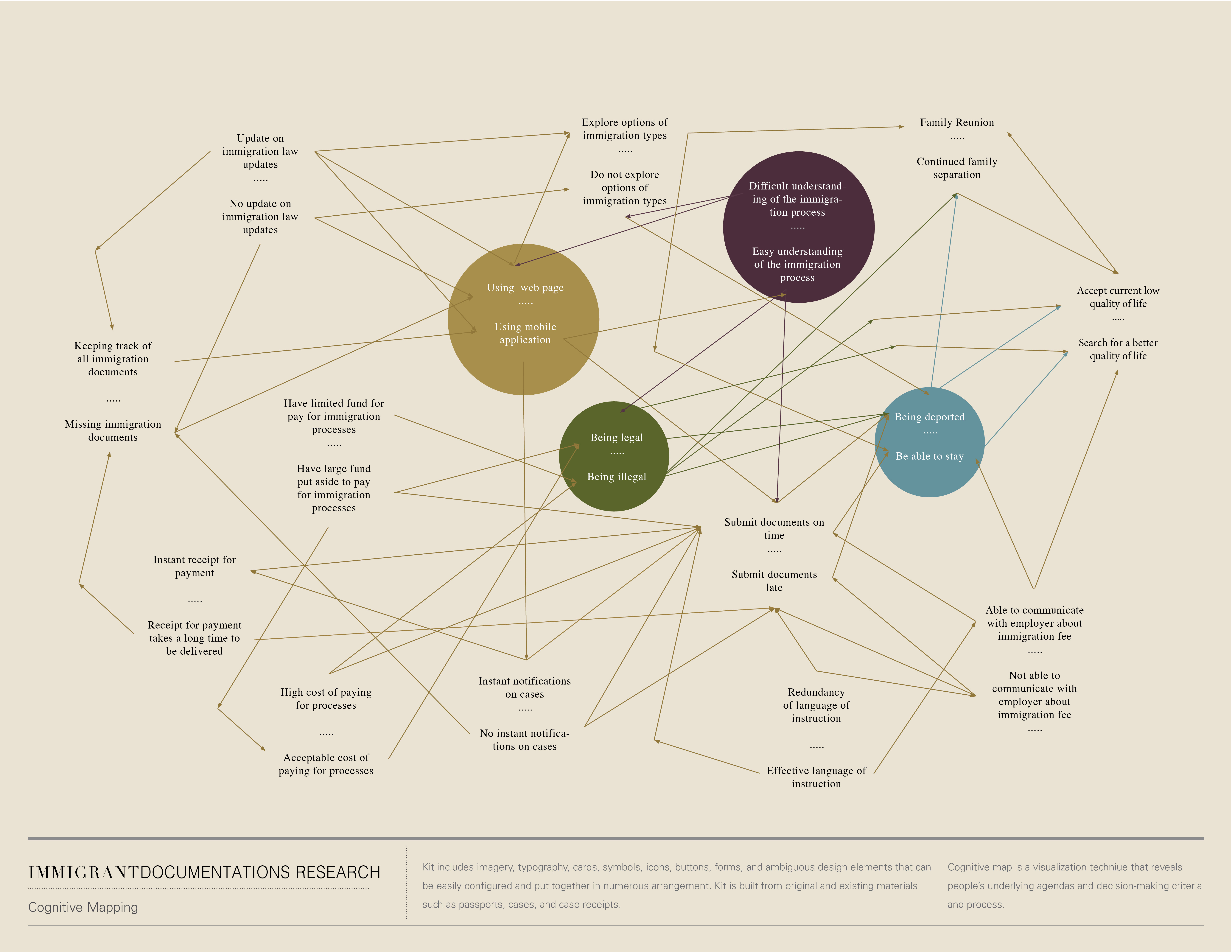
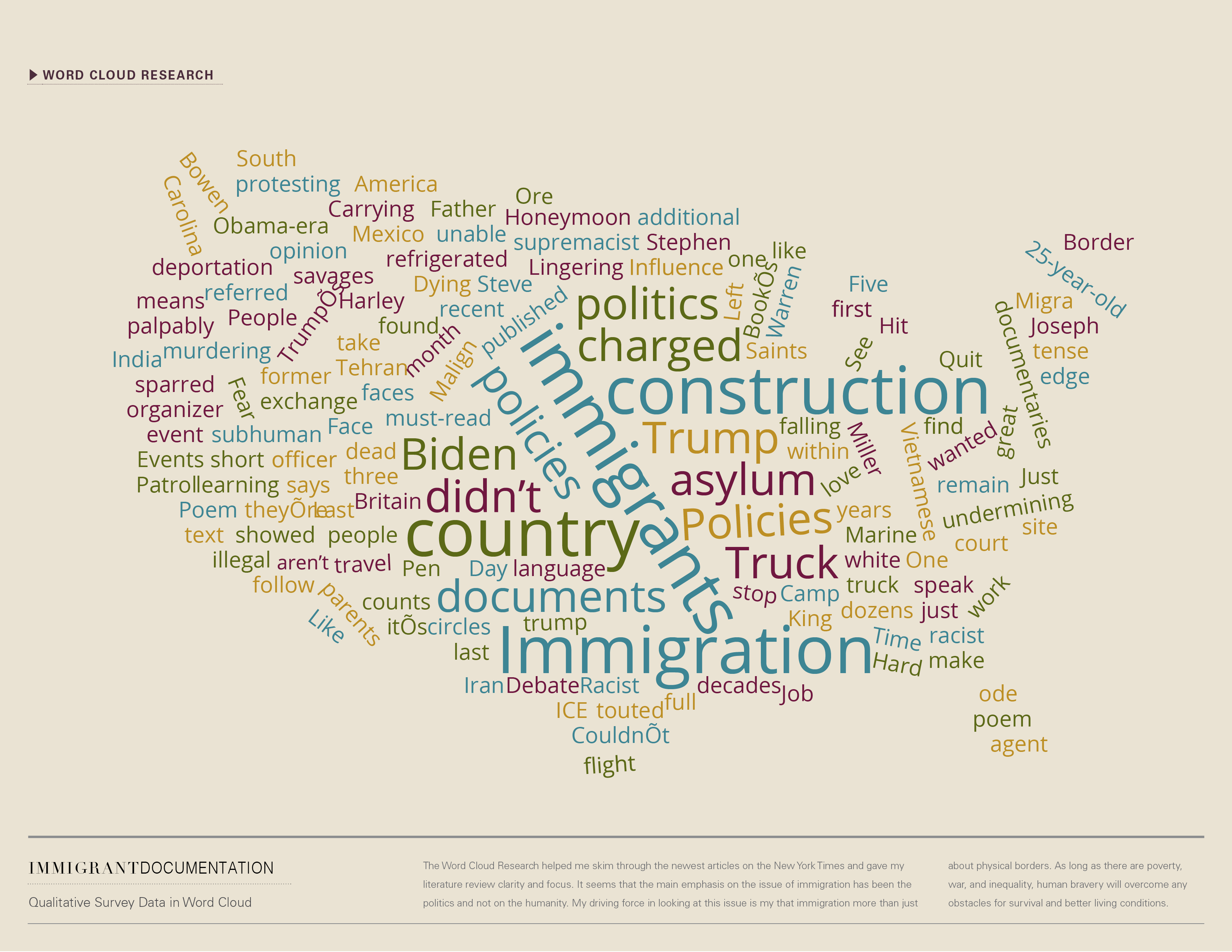
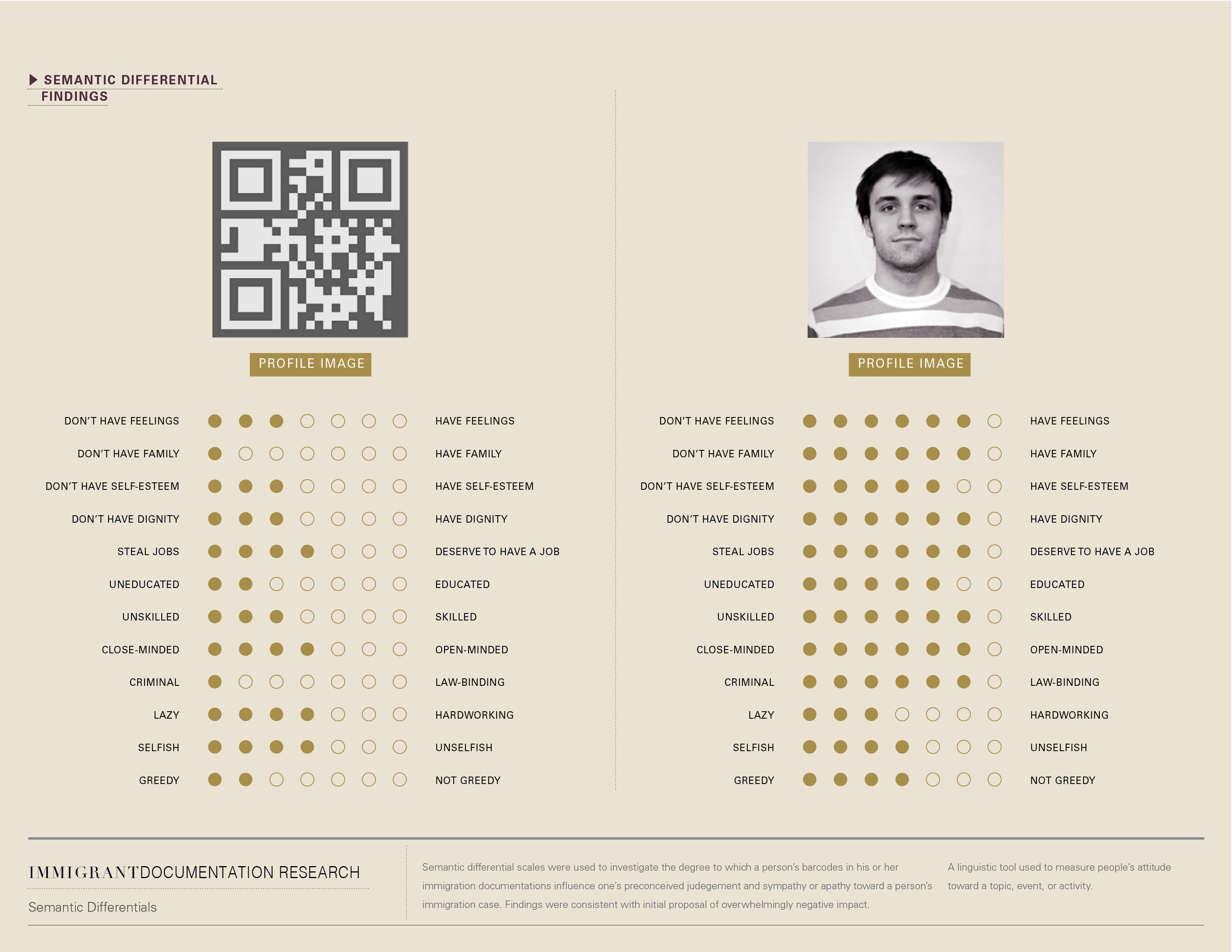
How we treat each other is based on not only our social interactions, but on how political structures shape our perceptions of people. As technology takes on a greater role in that structure, I examine how it carries patterns of bias and discrimination that need to be interrupted. In addition to demonstrating the personal aspect of the legal immigration process, I also wanted to demonstrate how it is subtly dehumanizing at the same time. Mobile technology bridges the gap between abstract processes and petitioners, but it also reduces individuals to a few lines of legal fee receipts. With the help of a tracking system that compares "non-citizens" to consumer products, the entire person is distilled into data, barcodes, and numbers. I am interested in the larger picture of immigration being more than just physical borders. Human bravery will overcome obstacles to a better life for as long as poverty, inequality, war, and inaccessibility remain.
Product thinking
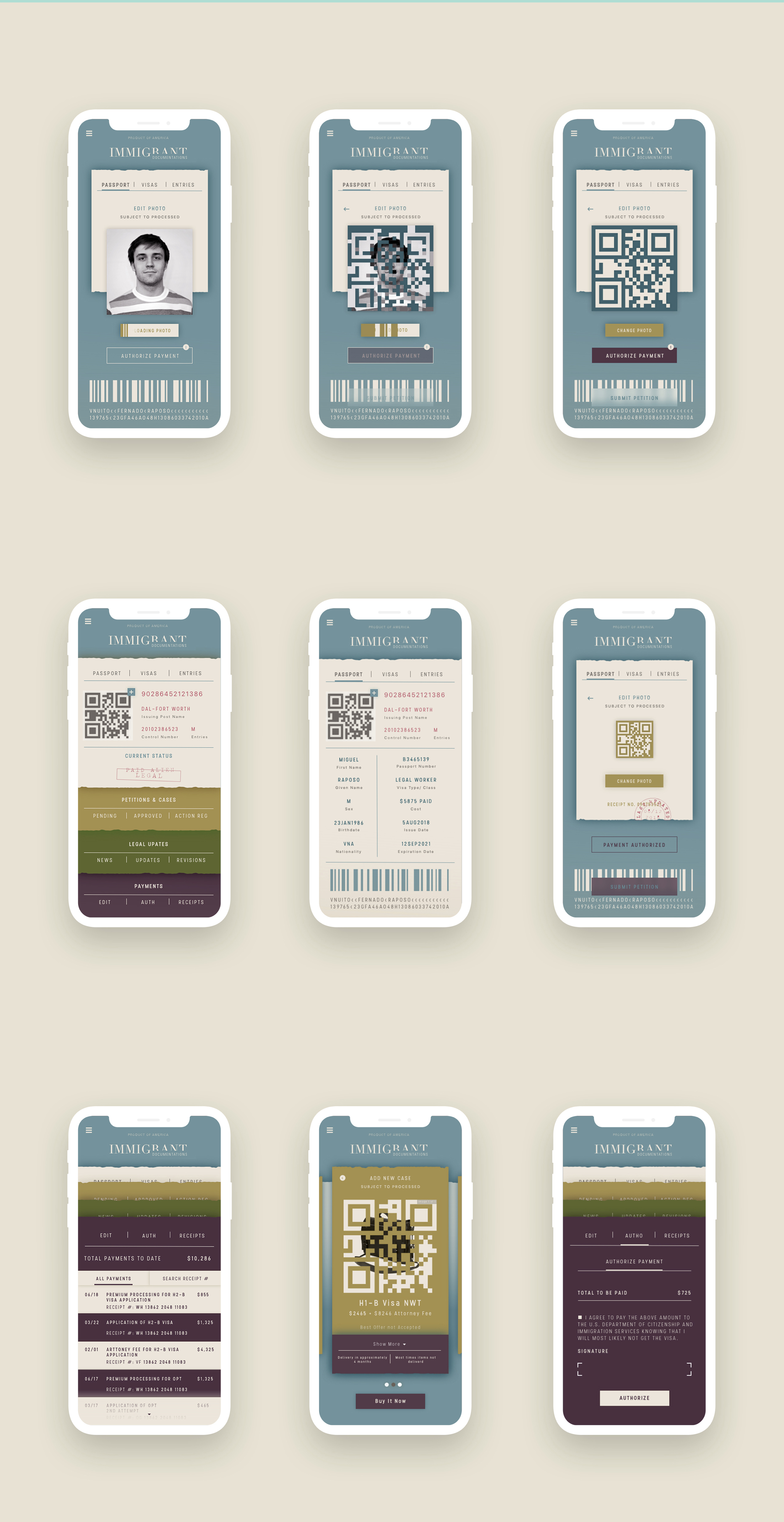
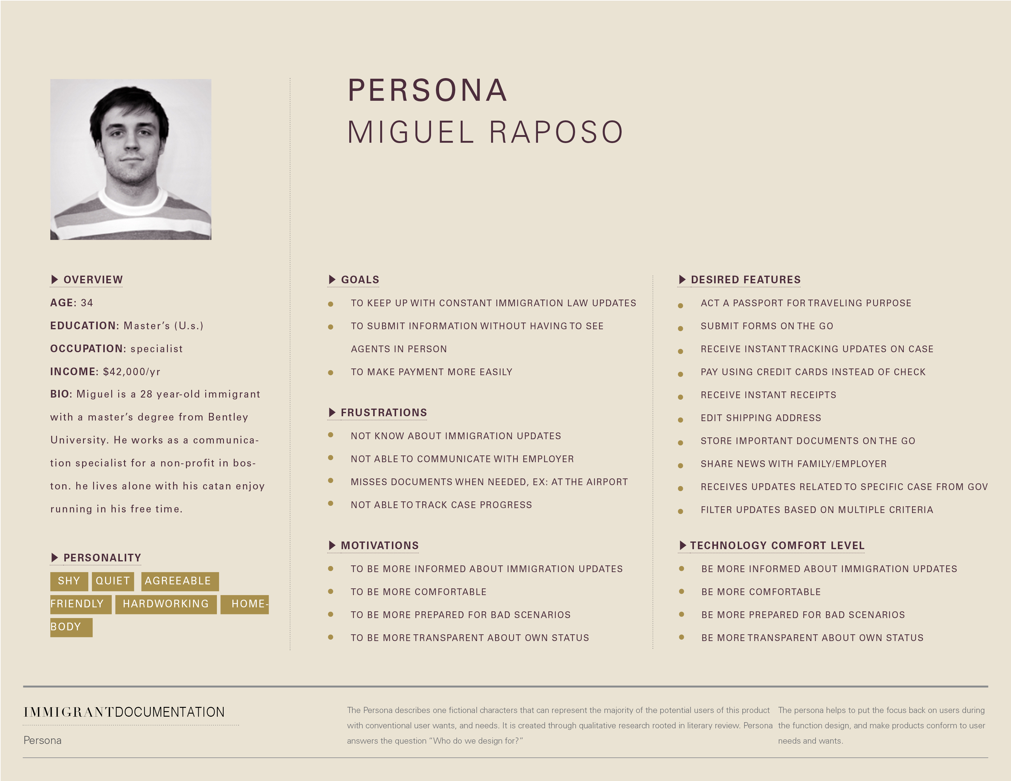
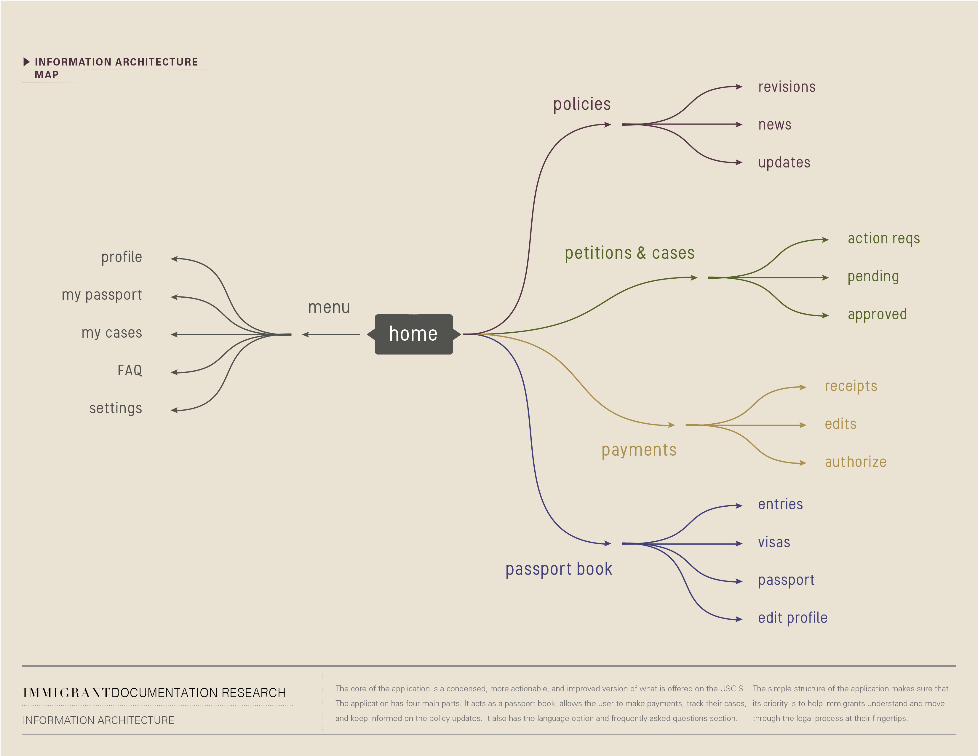
Immigration Documentation allows immigrants to keep track of their passport, entries, visa, and visa application status. In addition, it will notify the user whenever immigration policies change. In essence, the application provides a centralized, more actionable, and improved version of what is available on the U.S. Citizenship and Immigration Service, U.S. Customs and Border Protection, and U.S. Travel Documents. Each of these websites comes with its own set of issues and challenges, in addition to being separated. Reorganizing the information architecture was my main objective for simplifying the visa application process. On the surface, this is a pure usability issue. By addressing the fear of the user going through the difficult immigration process, I eased their emotional burden.
I am limited to working with what the USCIS and CBP currently offer in terms of information available to users for the project. For example, once the application is en route, there are no status updates available for the user, or in other words, the applicant or petitioner. This fact is accurately reflected in the application.
Interaction design
In my experience, the hardest interaction design problem was making sure that the user understood the capabilities of the application: it can help them apply, pay, and track their applications.Currently, the application process takes place in a variety of places: on websites, on paper, via mail, in the paralegal office. This is both a legal and policy issue and a usability issue. In my capacity as a designer not involved in the resolution of the first issue, I can increase the usability. Therefore, the application contains external links, along with a checklist and all guidelines organized in one place.
Visual design
At the same time, I developed something completely different in terms of theme and feel while working within existing pattern libraries and OS guidelines. It was important to me that the application be pleasing in an old-fashioned way. It needed to resembles an important physical object – the passport. Immigrant has no home in the United States. They might have to let go of everything they own. A person who is an immigrant does not have a sense of true ownership. This could be one of the few things they own, and they can take it with them.
The application should also reflects its users. It should looks like it has a history, and stories to tell, yet not overwhelming with excessive and unorganized information.
Juried exhibition and featured include: University of Texas at Tyler, Nazareth College in Rochester, NY, and North American Poster Exhibition at University of Northern Iowa.
︎ Back to top
Previous Project
Next Project